THE CENTRAL ALLOCATION FOR YOUR EQUITY STRATEGY
Stalbridge Capital is a newly formed Melbourne-based investment management company focused on finding great investment opportunities in domestic and global companies.
Like all small and new businesses, a quick logo done by family is often where things start. But once the business starts to find its groove, the logo and lack of cohesive branding quickly becomes the roadblock to growth.
Simplifying the complexity of technical expertise is a very big challenge. Although the ideal audiences are fluent in this technical industry, they are time-poor and like to get to the point quickly, letting the number results speak for themselves. With the aid of brand strategy workshops and extensive audience engagement, we could ascertain the balance of information transfer that would intrigue and invite the opportunity for a meeting.
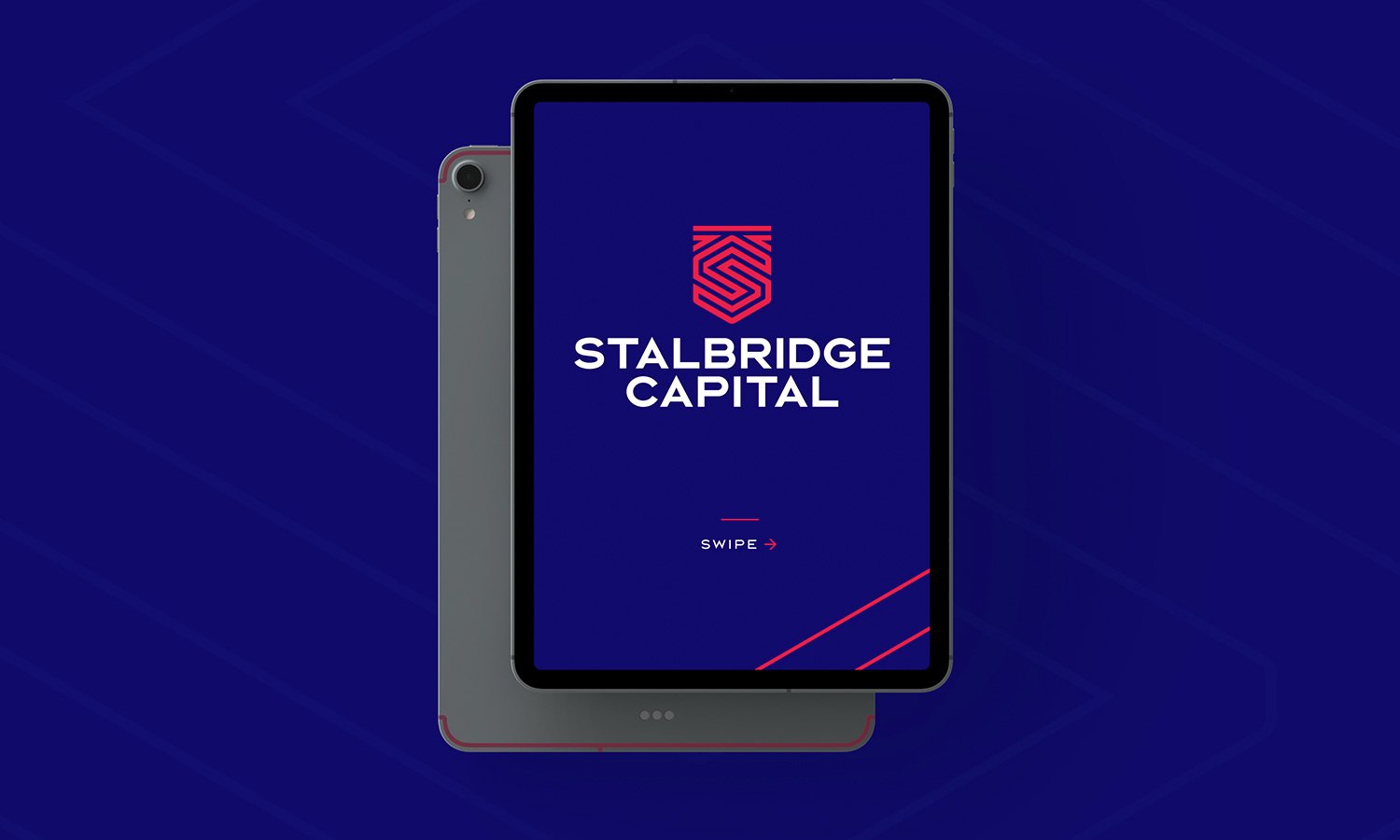
The logo represents a capital investment shield with the S + C initials. The maze helps you navigate the overwhelming financial world of information and gives a nod to England’s castle history from which the name is derived. The colour structure is crafted to be different than anything in the market and to indicate that this business is new, edgy and disruptive.
Services
Brand Strategy
Logo and Identity Design
Messaging
Copywriting
Photography
Website
PREVIOUS LOGO
NEW LOGO
LOGO BREAKDOWN
DELIVERABLES
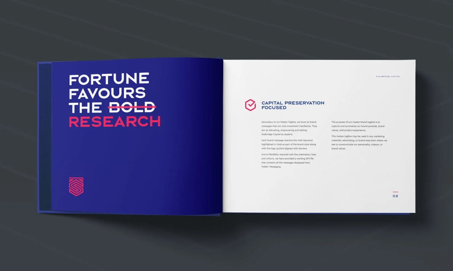
BRAND MESSAGING
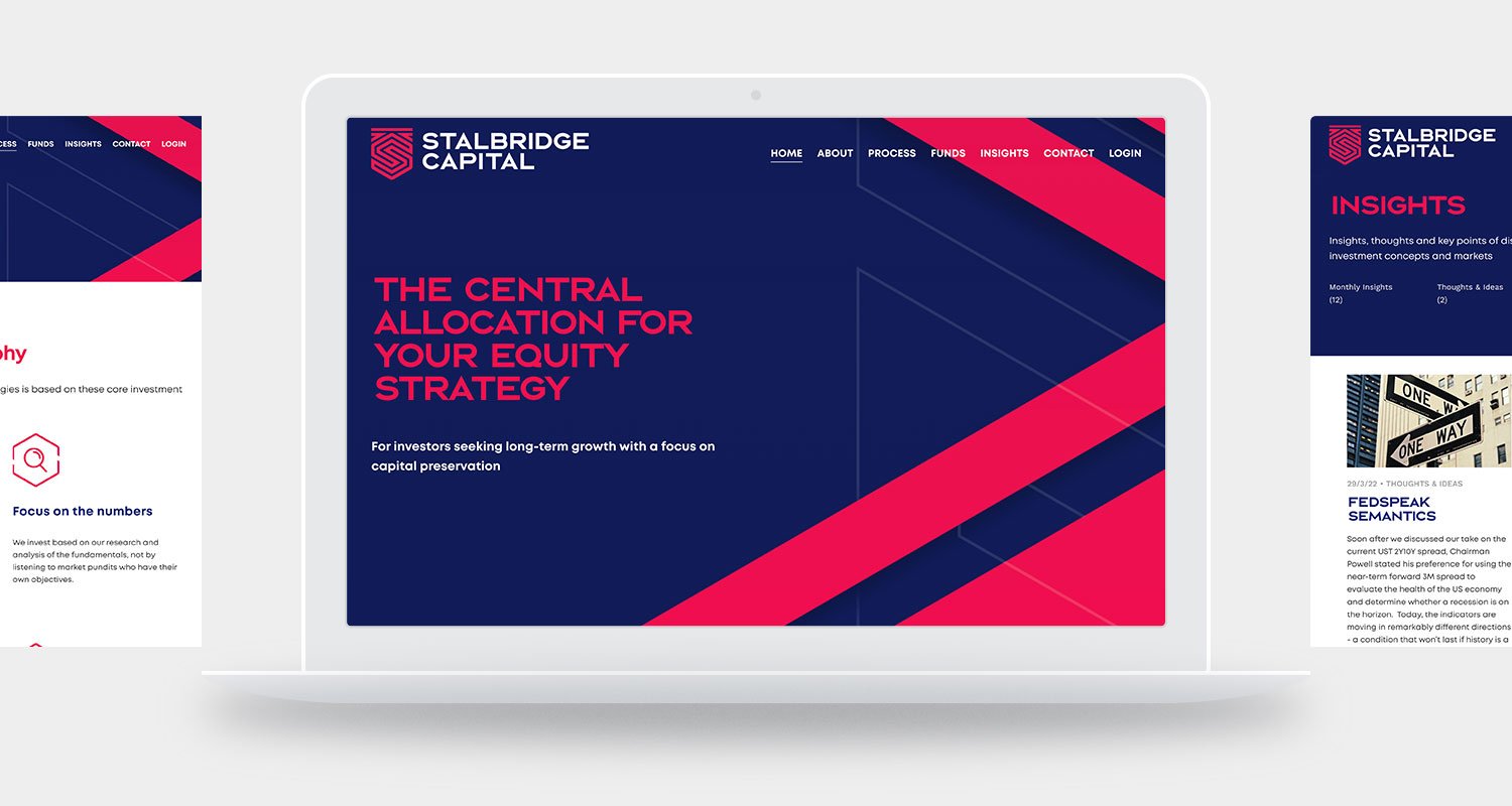
WEBSITE
Website link: www.stalbridgecapital.com.au


